 Inference
 Marketplace


Introduction
Most pages in the ZEDEDA console follow a consistent interaction model. Understanding these shared patterns helps you work efficiently across Infrastructure, Inference, and Marketplace without re-learning navigation for each service area. This article describes how global search, list pages, filters, and detail pages work. For exact navigation steps and page-specific fields, consult the relevant service documentation.Prerequisites
- A ZEDEDA account with access to at least one service area.
- Familiarity with the console layout described in Navigate the ZEDEDA Console.
Global Search
The header includes a global search bar available in all service areas. Use it to:- Navigate directly to a named page or section.
- Find a specific object by name, including nodes, clusters, applications, edge apps, virtual networks, volumes, app images, hardware models, and projects.
- Quickly reach administration pages such as Users or Roles.
Search within a page
You can narrow the search to a single page instead of searching everything. Highlight a page result and press Tab to enter that page’s scope. A chip with the page name appears to the left of the search field, the placeholder changes to “Search within” the page name, and the dropdown lists the objects that belong to that page. For example, entering the Projects scope lists your projects, even before you type anything. Scoped lists show up to 20 objects at a time. When the page holds more than that, the result count reads “Showing 20 of” the full total, so you can tell that the list is capped. Type to narrow the list further. To leave the scope, select the × on the page chip.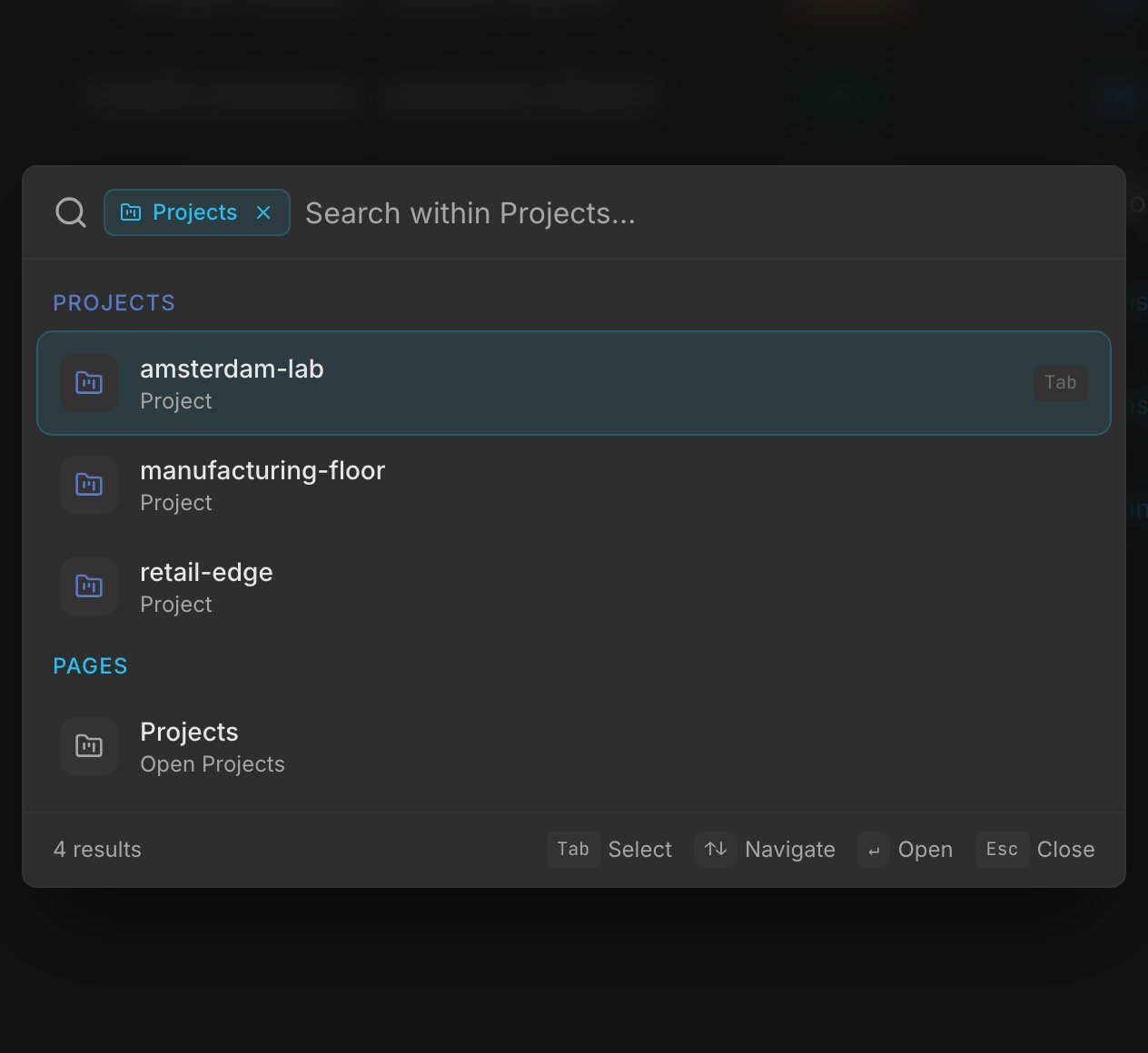
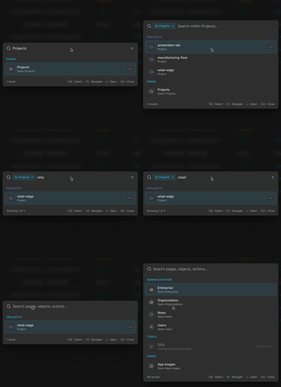
Search for Projects, press Tab to enter its scope, then type retail to narrow the results. Use × to leave the scope.
List and Table Pages
Object pages across the console use a consistent list or table layout. Most list pages include the following elements:- Page title and count. The page heading identifies the object type and displays the total number of objects in the current context.
- Create button. An Add or Create button lets you create an object of that type. Its position varies by page.
- Search and filter controls. Use the search bar or filter dropdowns to narrow the list by name, status, tags, or other attributes depending on the object type.
- Sortable columns. Click a column header to sort the list by that attribute. Click again to reverse the sort order.
- Customizable columns. Use the column picker to show, hide, or reorder columns, and drag a column edge to resize it. The console saves these column choices to your account, along with other layout preferences such as sidebar state and the auto-refresh interval. They apply in any browser you sign in from. Favorites are the exception and stay local to each browser.
- Export. Download table data as CSV, JSON, or Markdown and choose the rows and fields to include. See Export Table Data for the full workflow.
- Row actions. Each row has an actions menu or inline buttons for operations such as edit, deactivate, delete, or object-specific actions.
- Remembered filters. The console remembers the search text and filter selections for each list page in your browser, so they are still applied when you return to the page, open it in a new tab, or restart the browser. They are cleared when you sign out, when your session expires, or when you select a project in the header project switcher.
- Shareable views. Your search text, filter selections, and sort order are reflected in the page URL. Copy the URL to share the exact filtered and sorted view with another user. When a URL includes these parameters, they take precedence over the view state the console remembers for you.
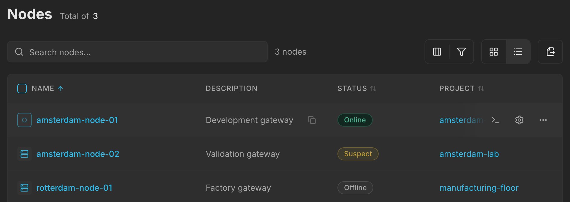
A customized Nodes list with four columns. Hover over a row to reveal its configuration and action controls.
Filter a list
Open Filters, choose an attribute, and select a value. The example selects the amsterdam-lab project, leaving its two nodes in the list. Use Clear all to remove the filter.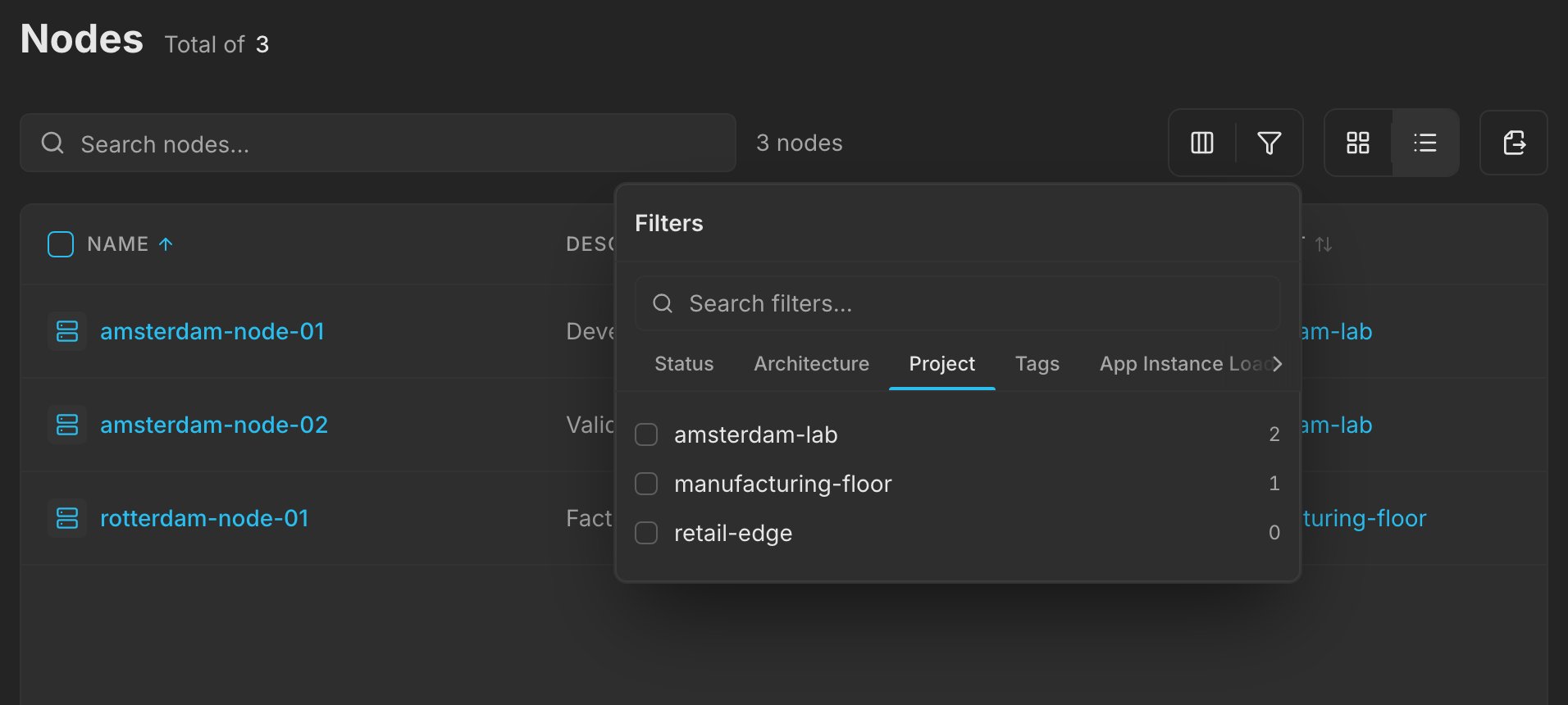
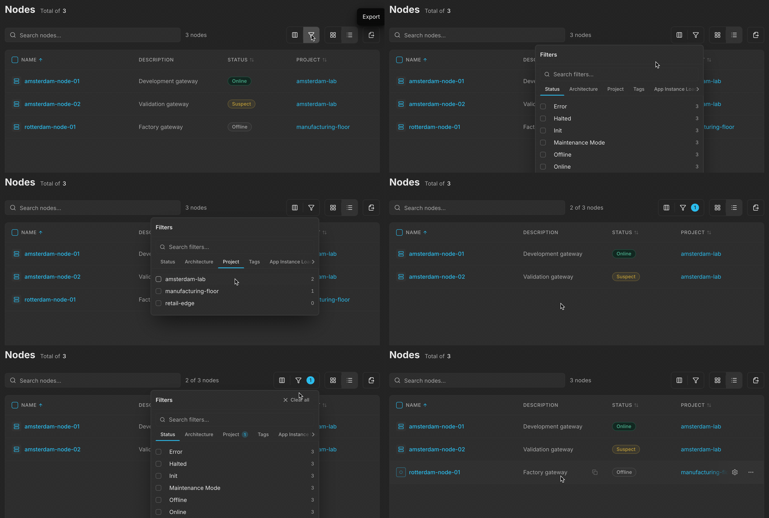
Select Project → amsterdam-lab, then close the filter menu to see the matching nodes. Clear all restores the full list.
Customize columns
Open Customize columns and use the visibility controls to show or hide a column. In this example, hiding Description makes room for the other columns; showing it restores the original layout.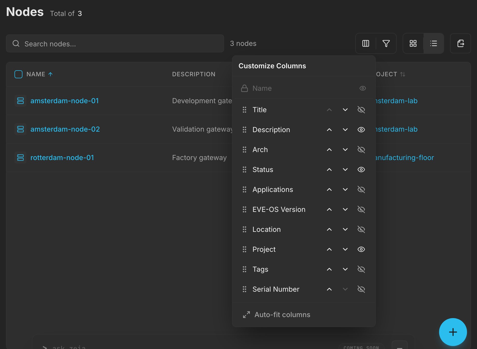
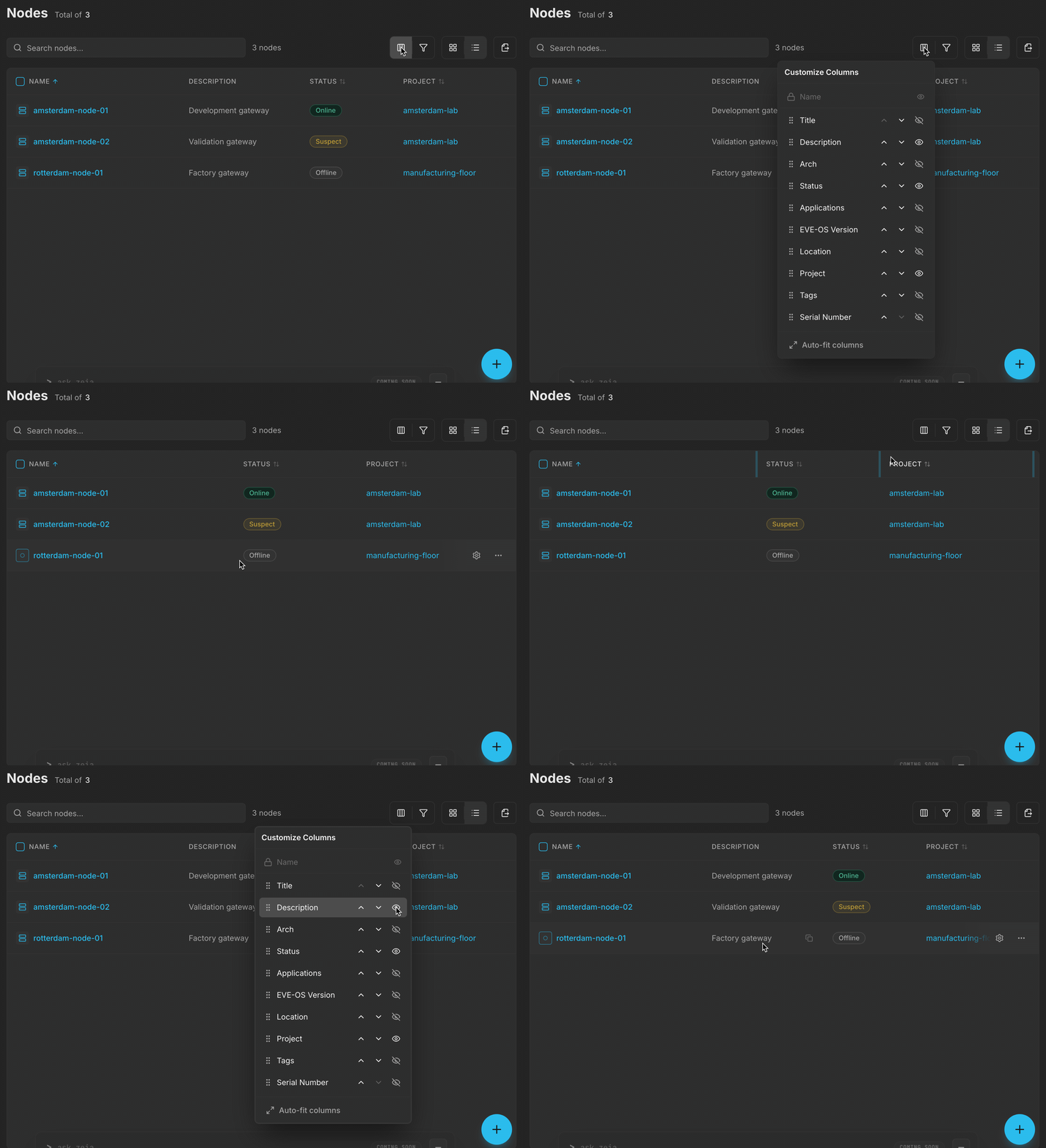
Hide Description, check the updated table, then show Description again.
Detail Pages
Selecting an object from a list opens its detail page. Detail pages follow a consistent structure:- Breadcrumbs. A breadcrumb path at the top of the page shows where the object sits in the hierarchy and provides a link back to the parent list.
- Object title and metadata. The page heading displays the object name along with key metadata such as type, creation date, and owner.
- Status indicators. Visual status badges show the current state of the object, for example running, stopped, or degraded.
- Relationships and related resources. Tabs or sections show associated objects, for example the applications running on a node or the volumes attached to an application.
- Action buttons. Buttons in the page header or detail sections provide available operations. Actions that require a higher permission level are hidden based on your role, not shown in a disabled (greyed-out) state. An action you do not see indicates a permission gap, not a product error.
- Shareable links. A copy-link control in the tab bar copies a link to the current view, including the active tab and the section you are viewing. Section headings are individually linkable, so a shared link opens the page scrolled to that section.
Create and Edit Flows
Create flows appear as full pages rather than side panels. To create a new object, click the create button on the list page. Edit flows open in a configuration modal over the page you started from. Select the Edit or Configure control (gear icon) on the object’s row in the list, or the same control in the header of its detail page. Both open the same modal. The modal footer has Cancel and a save action, and the save action stays disabled until the form is valid. Create and edit forms use the same field layout, with clearly labeled required and optional fields. Fields that cannot be changed after creation, such as an object’s system name, are not shown in the edit form.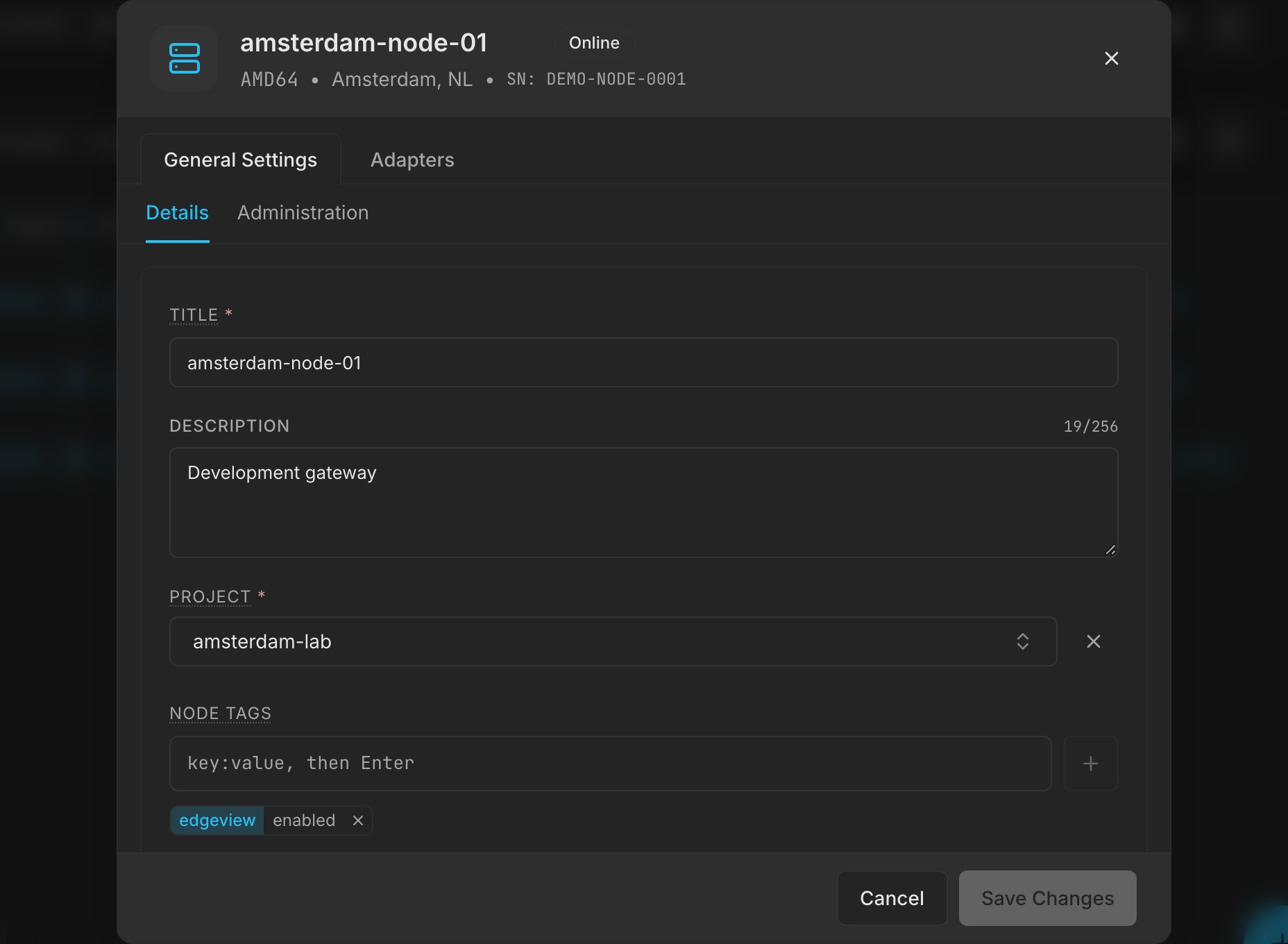
The configuration dialog keeps the list in the background. Cancel closes it without changing the node.
Next Steps
Navigate the ZEDEDA Console
Orient yourself in the sidebar, service areas, and key navigation patterns.
Permissions and Visibility
Understand how roles control access and what users can see.